
Muse For All SS25 Koleksiyonu İle Sezonun Şehirli Zarafetini Keşfedin

Yazı: Dila Görügen
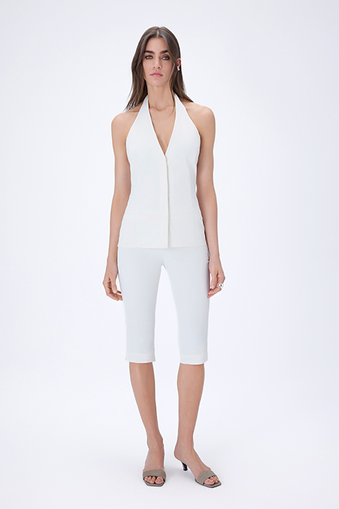
Yaz sezonunun kapıları aralandı. Değişen mevsimle birlikte gözlerimizi Muse For All’un sade ama etkili yaz hikâyesine çevirdik. İlkbahar/Yaz 2025 koleksiyonu modern kadının temposuna ayak uydururken stilinden ödün vermeyen, fonksiyonel ama zarif parçalarla dolu. Günün her anına uyum sağlayan bu tasarımlar, gardırobun vazgeçilmez parçaları olmaya aday.

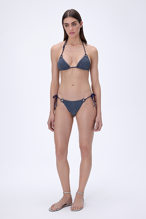
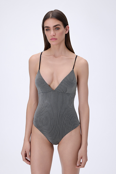
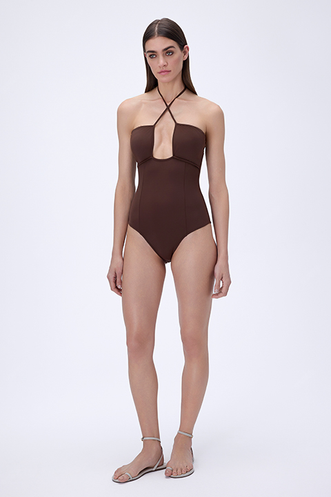
Doğal tonların hakimiyetinde ilerleyen koleksiyonda; beyazın ferahlığı, bejin sakinliği, hakinin doğallığı ve siyahın iddiası bir araya geliyor. İpek ve triko elbiselerden dinamik formlu denimlere, ince dokulu dantellerden fit yelek takımlarına kadar her parçada göz alıcı bir sadelik ve güç var. Malum, yaza giriş yapıyoruz, gözlerimiz plaj stilimizi tamamlayacak parçalara gidiyor. Her bir parçada markanın imzası haline gelen el işçiliğiyle hazırlanmış hafif ve geçirgen parçalar öne çıkıyor. Sahilde de şehirde de rahatlıkla kullanabileceğiniz stiller, Lucca Beach Bodrum’un favorilerinden olacak gibi.
Kısacası Muse For All’un İlkbahar/Yaz 2025 koleksiyonu; zamansız stil, konfor ve kaliteyi bir araya getirerek şıklığı sadece özel anlara değil, yazın her anına taşıyan kadınlar için vazgeçilmez olacak. Gelelim özel ve heyecanlı bir habere! Muse For All, Haziran ayında açıklamayı planladığı global bir iş birliği ile hepimizde merak uyandırıyor. Uluslararası bir markayla ortak hazırlanan kapsül koleksiyonuyla büyük bir sürprizi var! Yazın enerjisini özgün tasarımlarla buluşturarak İlkbahar/Yaz 2025 enerjisini bambaşka bir noktaya taşıyacak. Şimdiden kulislerde fısıldanmaya başlayan bu birliktelik, hem yaratıcı uyumuyla hem de stil oyunlarıyla fazlasıyla konuşulacak gibi görünüyor.
1/15
Muse For All
.circle {
position: relative;
width: 70px;
height: 70px;
cursor: pointer;
}
.circle svg {
fill: none;
stroke: #8a3ab9;
stroke-linecap: round;
stroke-width: 3;
stroke-dasharray: 1;
stroke-dashoffset: 0;
animation: stroke-draw 2s cubic-bezier(0.77, 0, 0.175, 1) infinite alternate;
display:block!important
}
.circle img {
position: absolute;
left: 50%;
top: 50%;
transform: translate(-50%, -50%);
border-radius: 50%;
}
@keyframes stroke-draw {
from {
stroke: #8a3ab9;
stroke-dasharray: 1;
}
to {
stroke: #cd486b;
transform: rotate(180deg);
stroke-dasharray: 8;
}
}
2/15
Muse For All
.circle {
position: relative;
width: 70px;
height: 70px;
cursor: pointer;
}
.circle svg {
fill: none;
stroke: #8a3ab9;
stroke-linecap: round;
stroke-width: 3;
stroke-dasharray: 1;
stroke-dashoffset: 0;
animation: stroke-draw 2s cubic-bezier(0.77, 0, 0.175, 1) infinite alternate;
display:block!important
}
.circle img {
position: absolute;
left: 50%;
top: 50%;
transform: translate(-50%, -50%);
border-radius: 50%;
}
@keyframes stroke-draw {
from {
stroke: #8a3ab9;
stroke-dasharray: 1;
}
to {
stroke: #cd486b;
transform: rotate(180deg);
stroke-dasharray: 8;
}
}
3/15
Muse For All
.circle {
position: relative;
width: 70px;
height: 70px;
cursor: pointer;
}
.circle svg {
fill: none;
stroke: #8a3ab9;
stroke-linecap: round;
stroke-width: 3;
stroke-dasharray: 1;
stroke-dashoffset: 0;
animation: stroke-draw 2s cubic-bezier(0.77, 0, 0.175, 1) infinite alternate;
display:block!important
}
.circle img {
position: absolute;
left: 50%;
top: 50%;
transform: translate(-50%, -50%);
border-radius: 50%;
}
@keyframes stroke-draw {
from {
stroke: #8a3ab9;
stroke-dasharray: 1;
}
to {
stroke: #cd486b;
transform: rotate(180deg);
stroke-dasharray: 8;
}
}
4/15
Muse For All
.circle {
position: relative;
width: 70px;
height: 70px;
cursor: pointer;
}
.circle svg {
fill: none;
stroke: #8a3ab9;
stroke-linecap: round;
stroke-width: 3;
stroke-dasharray: 1;
stroke-dashoffset: 0;
animation: stroke-draw 2s cubic-bezier(0.77, 0, 0.175, 1) infinite alternate;
display:block!important
}
.circle img {
position: absolute;
left: 50%;
top: 50%;
transform: translate(-50%, -50%);
border-radius: 50%;
}
@keyframes stroke-draw {
from {
stroke: #8a3ab9;
stroke-dasharray: 1;
}
to {
stroke: #cd486b;
transform: rotate(180deg);
stroke-dasharray: 8;
}
}
5/15
Muse For All
.circle {
position: relative;
width: 70px;
height: 70px;
cursor: pointer;
}
.circle svg {
fill: none;
stroke: #8a3ab9;
stroke-linecap: round;
stroke-width: 3;
stroke-dasharray: 1;
stroke-dashoffset: 0;
animation: stroke-draw 2s cubic-bezier(0.77, 0, 0.175, 1) infinite alternate;
display:block!important
}
.circle img {
position: absolute;
left: 50%;
top: 50%;
transform: translate(-50%, -50%);
border-radius: 50%;
}
@keyframes stroke-draw {
from {
stroke: #8a3ab9;
stroke-dasharray: 1;
}
to {
stroke: #cd486b;
transform: rotate(180deg);
stroke-dasharray: 8;
}
}
6/15
Muse For All
.circle {
position: relative;
width: 70px;
height: 70px;
cursor: pointer;
}
.circle svg {
fill: none;
stroke: #8a3ab9;
stroke-linecap: round;
stroke-width: 3;
stroke-dasharray: 1;
stroke-dashoffset: 0;
animation: stroke-draw 2s cubic-bezier(0.77, 0, 0.175, 1) infinite alternate;
display:block!important
}
.circle img {
position: absolute;
left: 50%;
top: 50%;
transform: translate(-50%, -50%);
border-radius: 50%;
}
@keyframes stroke-draw {
from {
stroke: #8a3ab9;
stroke-dasharray: 1;
}
to {
stroke: #cd486b;
transform: rotate(180deg);
stroke-dasharray: 8;
}
}
7/15
Muse For All
.circle {
position: relative;
width: 70px;
height: 70px;
cursor: pointer;
}
.circle svg {
fill: none;
stroke: #8a3ab9;
stroke-linecap: round;
stroke-width: 3;
stroke-dasharray: 1;
stroke-dashoffset: 0;
animation: stroke-draw 2s cubic-bezier(0.77, 0, 0.175, 1) infinite alternate;
display:block!important
}
.circle img {
position: absolute;
left: 50%;
top: 50%;
transform: translate(-50%, -50%);
border-radius: 50%;
}
@keyframes stroke-draw {
from {
stroke: #8a3ab9;
stroke-dasharray: 1;
}
to {
stroke: #cd486b;
transform: rotate(180deg);
stroke-dasharray: 8;
}
}
8/15
Muse For All
.circle {
position: relative;
width: 70px;
height: 70px;
cursor: pointer;
}
.circle svg {
fill: none;
stroke: #8a3ab9;
stroke-linecap: round;
stroke-width: 3;
stroke-dasharray: 1;
stroke-dashoffset: 0;
animation: stroke-draw 2s cubic-bezier(0.77, 0, 0.175, 1) infinite alternate;
display:block!important
}
.circle img {
position: absolute;
left: 50%;
top: 50%;
transform: translate(-50%, -50%);
border-radius: 50%;
}
@keyframes stroke-draw {
from {
stroke: #8a3ab9;
stroke-dasharray: 1;
}
to {
stroke: #cd486b;
transform: rotate(180deg);
stroke-dasharray: 8;
}
}
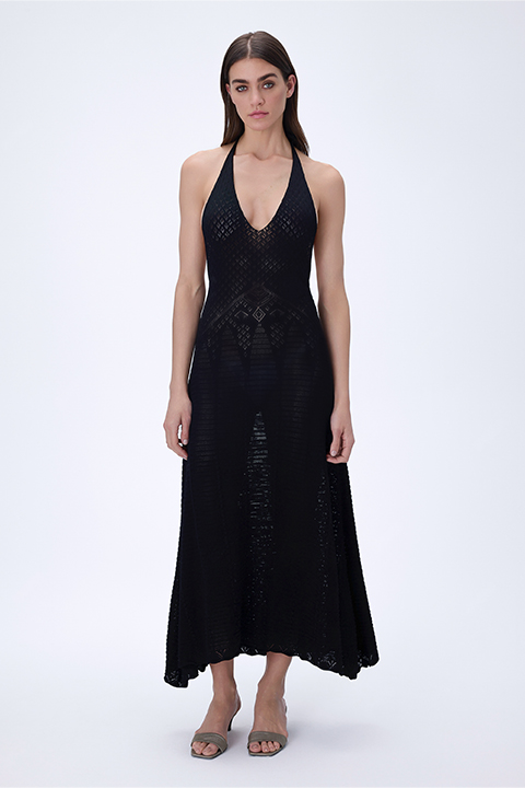
9/15
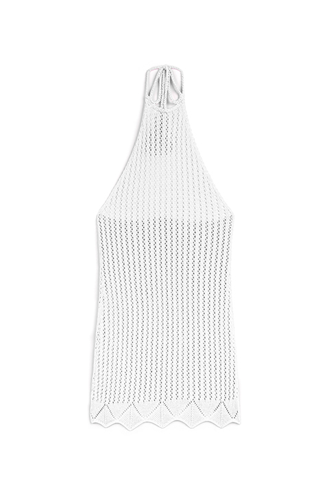
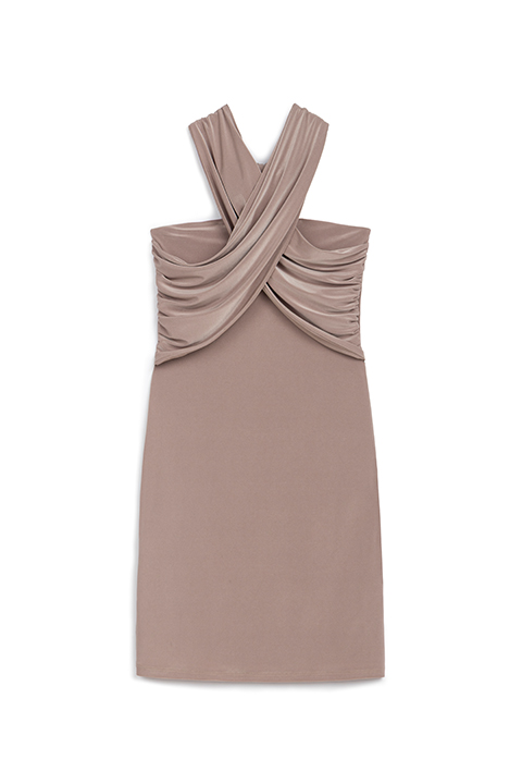
Clara Dress
9,100 TL
Muse For All
.circle {
position: relative;
width: 70px;
height: 70px;
cursor: pointer;
}
.circle svg {
fill: none;
stroke: #8a3ab9;
stroke-linecap: round;
stroke-width: 3;
stroke-dasharray: 1;
stroke-dashoffset: 0;
animation: stroke-draw 2s cubic-bezier(0.77, 0, 0.175, 1) infinite alternate;
display:block!important
}
.circle img {
position: absolute;
left: 50%;
top: 50%;
transform: translate(-50%, -50%);
border-radius: 50%;
}
@keyframes stroke-draw {
from {
stroke: #8a3ab9;
stroke-dasharray: 1;
}
to {
stroke: #cd486b;
transform: rotate(180deg);
stroke-dasharray: 8;
}
}
10/15
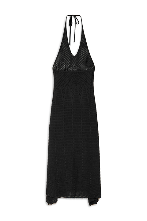
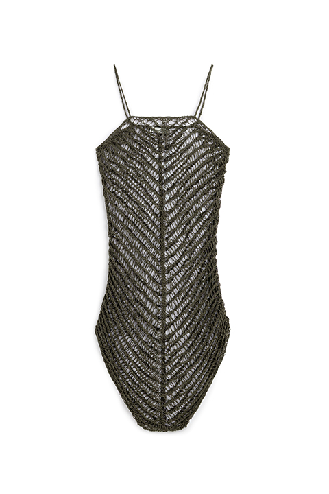
Cecilia Dress
13,200 TL
Muse For All
.circle {
position: relative;
width: 70px;
height: 70px;
cursor: pointer;
}
.circle svg {
fill: none;
stroke: #8a3ab9;
stroke-linecap: round;
stroke-width: 3;
stroke-dasharray: 1;
stroke-dashoffset: 0;
animation: stroke-draw 2s cubic-bezier(0.77, 0, 0.175, 1) infinite alternate;
display:block!important
}
.circle img {
position: absolute;
left: 50%;
top: 50%;
transform: translate(-50%, -50%);
border-radius: 50%;
}
@keyframes stroke-draw {
from {
stroke: #8a3ab9;
stroke-dasharray: 1;
}
to {
stroke: #cd486b;
transform: rotate(180deg);
stroke-dasharray: 8;
}
}
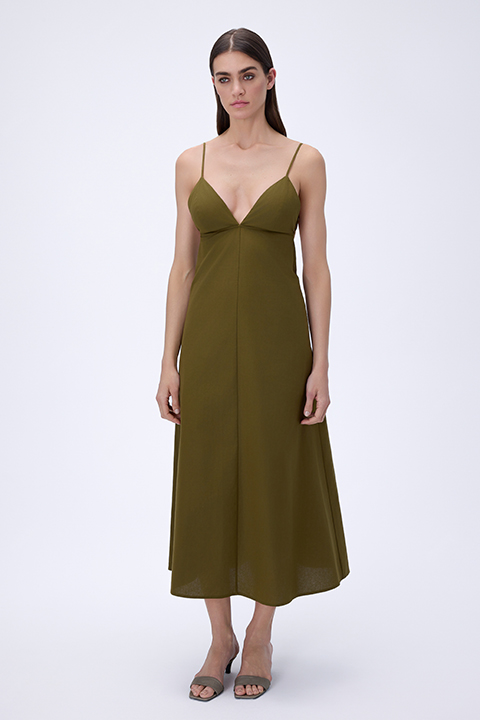
11/15
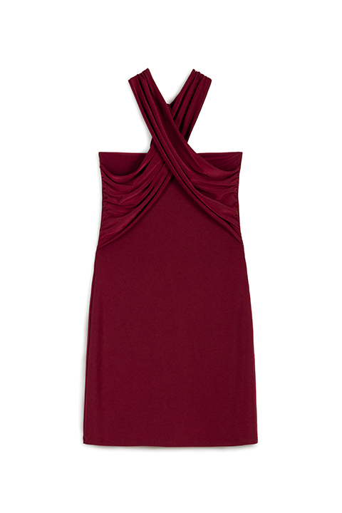
Gemma Dress
9,850 TL
Muse For All
.circle {
position: relative;
width: 70px;
height: 70px;
cursor: pointer;
}
.circle svg {
fill: none;
stroke: #8a3ab9;
stroke-linecap: round;
stroke-width: 3;
stroke-dasharray: 1;
stroke-dashoffset: 0;
animation: stroke-draw 2s cubic-bezier(0.77, 0, 0.175, 1) infinite alternate;
display:block!important
}
.circle img {
position: absolute;
left: 50%;
top: 50%;
transform: translate(-50%, -50%);
border-radius: 50%;
}
@keyframes stroke-draw {
from {
stroke: #8a3ab9;
stroke-dasharray: 1;
}
to {
stroke: #cd486b;
transform: rotate(180deg);
stroke-dasharray: 8;
}
}
12/15
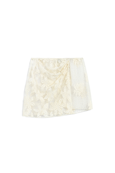
Anna Skirt
8,050 TL
Muse For All
.circle {
position: relative;
width: 70px;
height: 70px;
cursor: pointer;
}
.circle svg {
fill: none;
stroke: #8a3ab9;
stroke-linecap: round;
stroke-width: 3;
stroke-dasharray: 1;
stroke-dashoffset: 0;
animation: stroke-draw 2s cubic-bezier(0.77, 0, 0.175, 1) infinite alternate;
display:block!important
}
.circle img {
position: absolute;
left: 50%;
top: 50%;
transform: translate(-50%, -50%);
border-radius: 50%;
}
@keyframes stroke-draw {
from {
stroke: #8a3ab9;
stroke-dasharray: 1;
}
to {
stroke: #cd486b;
transform: rotate(180deg);
stroke-dasharray: 8;
}
}
13/15
Gemma Dress
9,850 TL
Muse For All
.circle {
position: relative;
width: 70px;
height: 70px;
cursor: pointer;
}
.circle svg {
fill: none;
stroke: #8a3ab9;
stroke-linecap: round;
stroke-width: 3;
stroke-dasharray: 1;
stroke-dashoffset: 0;
animation: stroke-draw 2s cubic-bezier(0.77, 0, 0.175, 1) infinite alternate;
display:block!important
}
.circle img {
position: absolute;
left: 50%;
top: 50%;
transform: translate(-50%, -50%);
border-radius: 50%;
}
@keyframes stroke-draw {
from {
stroke: #8a3ab9;
stroke-dasharray: 1;
}
to {
stroke: #cd486b;
transform: rotate(180deg);
stroke-dasharray: 8;
}
}
14/15
Marley Dress
9,100 TL
Muse For All
.circle {
position: relative;
width: 70px;
height: 70px;
cursor: pointer;
}
.circle svg {
fill: none;
stroke: #8a3ab9;
stroke-linecap: round;
stroke-width: 3;
stroke-dasharray: 1;
stroke-dashoffset: 0;
animation: stroke-draw 2s cubic-bezier(0.77, 0, 0.175, 1) infinite alternate;
display:block!important
}
.circle img {
position: absolute;
left: 50%;
top: 50%;
transform: translate(-50%, -50%);
border-radius: 50%;
}
@keyframes stroke-draw {
from {
stroke: #8a3ab9;
stroke-dasharray: 1;
}
to {
stroke: #cd486b;
transform: rotate(180deg);
stroke-dasharray: 8;
}
}
15/15
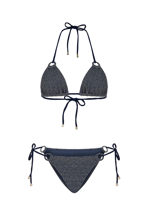
Alice Bikini
10,150 TL
Muse For All
.circle {
position: relative;
width: 70px;
height: 70px;
cursor: pointer;
}
.circle svg {
fill: none;
stroke: #8a3ab9;
stroke-linecap: round;
stroke-width: 3;
stroke-dasharray: 1;
stroke-dashoffset: 0;
animation: stroke-draw 2s cubic-bezier(0.77, 0, 0.175, 1) infinite alternate;
display:block!important
}
.circle img {
position: absolute;
left: 50%;
top: 50%;
transform: translate(-50%, -50%);
border-radius: 50%;
}
@keyframes stroke-draw {
from {
stroke: #8a3ab9;
stroke-dasharray: 1;
}
to {
stroke: #cd486b;
transform: rotate(180deg);
stroke-dasharray: 8;
}
}